Colours are hugely important in painting, both in terms of aesthetics and for understanding. Colours have been imbued with meaning through the ages, which means that changes in the chemistry can lead to misunderstanding in the interpretation. Sometimes the colour change can be seen at edges that have been exposed to different conditions behind the frame’s rebate. At other times there are clues in the title of the picture that point to discolouration, but other times all of colour has changed and it requires scientific analysis to establish that it has occurred at all.
One of my favourite examples of colour change in a painting making a difference to the interpretation is The National Gallery’s painting by Robert Campin of The Virgin and Child Before a Firescreen, as described in The National Gallery Technical Bulletin Volume 15 from 1994. The Virgin Mary is shown seated reading her prayer book in a white dress. The white dress has connotations of purity, which seems appropriate for the Virgin. Except it wasn’t originally white, it was mauve, which was discovered through microscopic analysis of a paint sample. The pigments used included fugitive red lake and what we end up seeing today is the lead white that was used to make the colour lighter. Purple tones don’t usually signify purity but royalty. It puts a different spin on things.
There are also fugitive yellow pigments, as can be seen at the National Gallery of Scotland in Greuze’s painting A Girl with a Dead Canary, that fade to leave in this case blue leaves and a white canary. Yet further complications can arise when changes in the chemistry of your pigment make its Refractive Index (to do with how it interacts with light) match that of the medium (oil binder) and your paint becomes transparent. This is most often seen in thinly painted white pigments. One example is the semi-transparent newspaper in front of the fire in Sadler’s The End of the Skein at the Lady Lever Gallery. Someone has just published research exploring colour changes in the work of a particular Flemish painter who encountered both of these unlucky colour changes entitled “Blue Cabbages and Invisible Onions”.

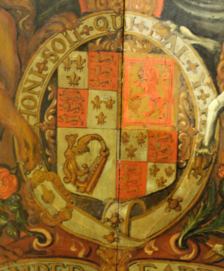
I’m working on an early 18th century coat of arms from a church, which shows the Royal Arms of Queen Anne. I must have been looking at it for quite some time before I realised that large parts of the scheme that look white should in fact be blue. In all likelihood this is an example of colour change in an oil painting. A blue pigment called smalt, made of cobalt containing glass, is known to fade to a pinkish grey or brown, and was used widely at this period. While many people associate light exposure with fading, often correctly, it seems that smalt discolours because of humidity in the environment.

The meaning of the coat of arms isn’t changed as it is still recognisable as the scheme used by Queen Anne, but the visual effect is left wanting. What I find interesting is that the old repairs have tried to match the discolouration, including the yellow varnish, so the change must have occurred quite early in its history. Likewise I won’t retouch the discoloured areas to reflect the original intentions of the artist as this would hide the original material.
So look out for blue leaves and transparent newspapers and remember that you can’t always believe your eyes!
